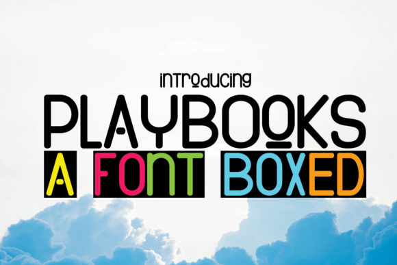
PlayBooks: A Friendly, Confident Display Font for Digital Brands
It started with a hero section—just me, a half-finished boutique coaching site, and a headline that felt… safe. Too safe. I swapped in PlayBooks on a whim while testing contrast over a soft gradient background, and suddenly the whole layout exhaled. The words “Your Calm, Creative Launch” didn’t just sit there—they leaned in, clear and warm, like a trusted collaborator who knows when to speak up and when to step back. That’s when I knew PlayBooks wasn’t just another display font—it was a quiet upgrade to how digital spaces communicate intention.
What Makes PlayBooks Feel So Naturally Digital
PlayBooks is a modern display font built for presence—not pretension. It’s clean but not sterile, friendly but not frivolous. Think rounded terminals, open counters, and consistent stroke weight—details that translate beautifully across screens. There’s no aggressive sharpness or exaggerated flair, which means it avoids visual fatigue during quick scanning. On mobile, it holds its shape without blurring or collapsing; on desktop, it adds character without competing with imagery or interface elements. As a display font, it thrives where impact matters most: headlines, section titles, call-to-action buttons, and branded banners.
How It Performs in Real Layouts
I tested PlayBooks across six common web scenarios—and each time, it earned its place:
- Landing page headers: Paired with a neutral sans serif (like Inter or Manrope) for body copy, PlayBooks gave the headline hierarchy and warmth without sacrificing clarity.
- CTA buttons: At 18–20px on mobile, it remained legible and inviting—even with subtle letter-spacing for breathing room.
- Image overlays: Over muted photography or soft color blocks, PlayBooks stayed readable at medium weight, thanks to its generous x-height and balanced spacing.
- Portfolio project titles: On a creative agency homepage, it added personality to case study cards without undermining professionalism.
- Blog post headers: Used sparingly for H2s (not H3s or body), it created rhythm between sections without demanding attention.
- Digital brand kits: Included in a client’s Figma library, designers consistently chose it for hero text and social preview graphics—proof of its intuitive fit.
Crucially, PlayBooks doesn’t try to do everything. It’s not meant for navigation menus, form fields, or paragraph text—and that’s a strength. Its purpose is to anchor moments of emphasis, not fill space.
Readability & Responsiveness, Tested
On a 375px viewport, PlayBooks stays crisp down to 16px—but only for short phrases. I wouldn’t recommend it for multi-line button labels or dense feature lists. For accessibility, it pairs well with WCAG-compliant sans serifs: the contrast between its gentle curves and a clean, highly legible body font creates natural visual flow. It also renders smoothly across Chrome, Safari, and Firefox—no hinting issues or jagged edges—even when loaded as a variable webfont.
Dark mode? It works. Light text on deep navy or charcoal reads cleanly, especially with a hairline stroke adjustment in CSS if needed. Just avoid ultra-thin weights on low-contrast backgrounds—stick with Regular or Medium for reliability.
Smart Pairings for Web Designers
PlayBooks shines brightest when paired intentionally. My go-to combos:
- With a friendly sans serif: Inter, Poppins, or Work Sans for body copy and UI labels—clean, humanist, and highly legible.
- With a refined serif: Lora or Crimson Pro for editorial-style blogs or premium service pages—adds sophistication without stiffness.
- With a subtle script: Only as an accent—think logo lockups or signature lines—not for functional text.
Avoid pairing it with other decorative fonts or overly condensed typefaces. PlayBooks carries enough personality on its own; it doesn’t need competition.
What to Check Before You Use It
Before dropping PlayBooks into a live site or client project, I always verify:
- Webfont availability: Confirm the license includes WOFF2 support and proper hosting guidance.
- Weights included: At minimum, Regular and Medium are essential for responsive scaling. Bold helps for high-impact CTAs.
- Licensing scope: Ensure commercial use covers SaaS platforms, client websites, and digital templates you sell.
- Language coverage: If your audience includes European or extended Latin characters, double-check glyph support.
- Alternates or stylistic sets: Not critical for web use, but nice to have for subtle variation in branding assets.
One note: PlayBooks isn’t optimized for long-form reading or data-dense interfaces. Skip it for dashboards, documentation, or pricing tables—save it for moments where tone and trust matter more than density.
Why It Fits Modern Digital Branding
In a landscape full of either cold minimalism or chaotic ornamentation, PlayBooks lands gently in the middle—confident, approachable, and quietly polished. It supports brand voice without shouting over it. Whether you’re launching a mindful wellness course, refreshing a local studio’s site, or building a product landing page for a creative tool, PlayBooks helps your message feel both intentional and human. It doesn’t distract. It doesn’t overwhelm. It simply makes your words feel like they belong—right where they are.